手把手教你做'面包屑'导航栏(进阶篇)-面包屑制作方法
2023-04-23 19:14:51
今天我们继续来写面包屑导航栏,之前的教程:手把手教你做面包屑导航栏已经做出了一个基本的可以满足大部分需求的样式了,但是最后还留下一个问题,那就是:

如果我们要实现没有背景的带边框的样式该怎么做呢?今天的教程就是来实现边框的样式.
这种 border 无内容的样式是无法实现边框的,这点可以确定,所以这也就局限了为什么之前一篇教程中我会在最后提出这个问题,那么我们该用什么方法来实现呢?方法总是有的.
首先,还是那个套路:
<!DOCTYPE html>
<html lang="en">
<head>
<meta charset="UTF-8">
<title>面包屑导航</title>
<style type="text/css">
</style>
</head>
<body>
<div id="crumbs">
<ul>
<li>导航栏1</li>
<li>导航栏2</li>
<li>导航栏3</li>
<li>导航栏4</li>
</ul>
</div>
</body>
</html>
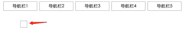
我们以此为基础,然后我们要做出五个长方形:
#crumbs ul li {
float: left;
list-style-type: none;
border-left: 1px solid gray;
border-top: 1px solid gray;
border-bottom: 1px solid gray;
border-right: 1px solid gray;
display: block;
float: left;
height: 40px;
width: 150px;
background: transparent;
text-align: center;
position: relative;
margin: 0 10px 0 0;
font-size: 20px;
text-decoration: none;
color: black;
line-height: 40px;
}
看效果:

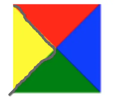
恩,带边框的基本样式出来了.然后!重点来了,我们要思考怎么做出箭头的形状,用 border 肯定是行不通的,所以我们得想其他方法.这里我们来看一个小例子:
看到这张图相信很多人已经想到了,我们只需要一个正方形,把它旋转45度,再选择合适的长度拼接上去就可以实现右边的箭头了,当然,左边的凹陷也是可以做的.
#crumbs ul li:after {
content: "";
position: absolute;
border-top: 1px solid gray;
border-right: 1px solid gray;
width: 29px;
height: 29px;
right: -15px;
top: 5px;
z-index: 5;
transform: rotate(45deg);
color: black;
background: white;
}

#crumbs ul li:before {
content: "";
position: absolute;
border-top: 1px solid gray;
border-right: 1px solid gray;
width: 29px;
height: 29px;
left: -15px;
top: 5px;
transform: rotate(45deg);
color: black;
background: white;
}

这样是不是带边框的就出来了呢? 其实跟上一篇教程并没有很大区别,但是你要能想到这个方法,才能做出这样的效果.其他的效果在上一篇文章中已经有具体讲解,这里就直接贴代码了
#crumbs ul li:first-child {
border-top-left-radius: 20px;
border-bottom-left-radius: 20px;
}
#crumbs ul li:first-child:before {
display: none;
}
#crumbs ul li:last-child {
/*padding-right: 60px;*/
border-right: 1px solid gray;
border-top-right-radius: 20px;
border-bottom-right-radius: 20px;
}
#crumbs ul li:last-child:after {
display: none;
}
#crumbs ul li:hover {
border-left: 1px solid #3498db;
border-top: 1px solid #3498db;
border-bottom: 1px solid #3498db;
}
#crumbs ul li:hover:after {
border-right: 1px solid #3498db;
border-top: 1px solid #3498db;
}
#crumbs ul li:hover:before {
border-right: 1px solid #3498db;
border-top: 1px solid #3498db;
}
#crumbs ul li:hover:last-child {
border-right: 1px solid #3498db;
}
最后的效果就是这样的:

至此,面包屑导航栏的教程就写完了,如果你有什么想跟我分享的,欢迎在下面评论,或者也可以关注我的微信公众号: 「皮蛋菌丶」
以上就是关于《手把手教你做'面包屑'导航栏(进阶篇)-面包屑制作方法》的全部内容,本文网址:https://www.7ca.cn/baike/18329.shtml,如对您有帮助可以分享给好友,谢谢。
声明